Tile is the surface that ties a kitchen backsplash, a bathroom wall, a shower, and a floor together — and the surface that most consistently shows the difference between a disciplined palette and an overworked one. This guide walks through tile direction by location, the format and palette decisions that age well, the grout color question, and how the materials combine across a kitchen or bathroom.
What this guide covers
Tile direction for kitchen backsplashes, bathroom walls and wainscot, shower walls, shower floors, and bathroom floors: format, palette, grout, maintenance footprint, and how to combine materials so the room reads as a single composition rather than a collection.
The tile material landscape
| Material | Typical location | Maintenance footprint |
|---|---|---|
| Glazed ceramic (subway, handmade-look) | Kitchen backsplash, bathroom wainscot | Low. Wipe-clean surface. |
| Porcelain (large-format, plank) | Bathroom walls, shower walls, floors | Low. Very durable. |
| Mosaic (penny round, hex, marble) | Shower floors, accent zones, niches | Mid. More grout per square foot. |
| Natural marble | Bathroom walls, primary suite features | Higher. Sealed periodically. |
| Limestone or travertine | Floors, accent walls in traditional homes | Higher. Sealing required. |
| Glass (mosaic or large-format) | Backsplash, shower accent strips | Low cleaning. Reads contemporary. |
| Cement tile (encaustic-look) | Floors, feature walls, statement powder rooms | Higher. Patterns date faster. |
Each material has a place; the question is which one fits the location, the home era, and the maintenance tolerance of the household.
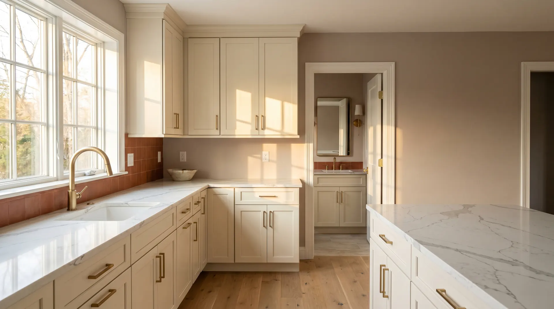
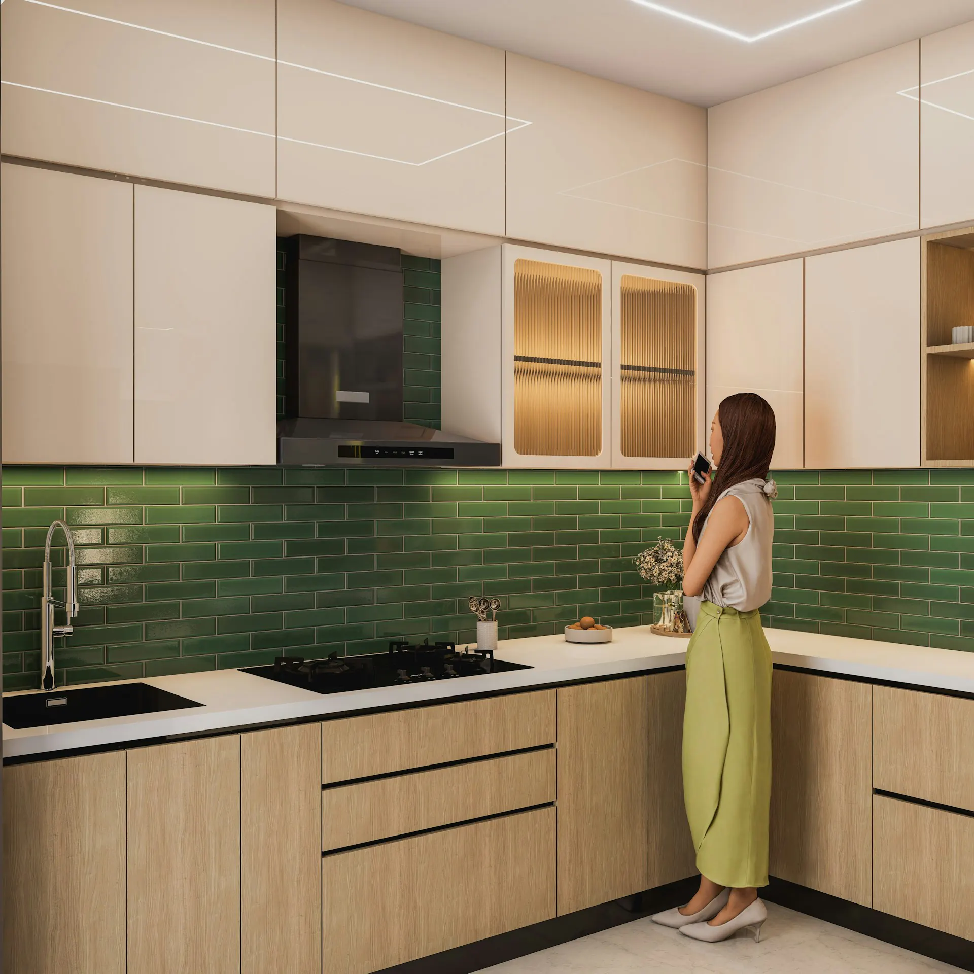
Kitchen backsplash
The kitchen backsplash is the tile decision that gets discussed most and overthought most. The reliable directions in Bergen County kitchens:
Classic 3x6 subway in glazed ceramic remains the highest-reliability choice. White, warm white, or soft cream. Works in nearly every home era.
Larger 4x12 or 4x16 subway reads slightly more contemporary while still age-resistant. Works well in transitional kitchens.
Handmade-look ceramic adds gentle texture and reads warmer than precision-machined subway. A strong choice for traditional and transitional homes.
Large-format porcelain panels read fully contemporary. Strong in modern renovations, less reliable in traditional homes.
Small geometric mosaics (penny round, hexagon, herringbone) add character but date faster than full-field subway. Use as accent strips or behind the range only.
The backsplash should coordinate with the cabinet color and the counter pattern, not stand against them. A busy backsplash against a busy counter reads as visual overload.
Bathroom walls and wainscot
Bathroom wall tile breaks into wainscot (a partial-height tile band, typically 36 to 48 inches up the wall) and full-height (floor to ceiling).
Wainscot direction — classic 3x6 subway, larger 4x12 or 4x16, or handmade-look ceramic. Works in traditional and transitional bathrooms. The wall above the wainscot is paint.
Full-height direction — large-format porcelain in a single field, floor to ceiling. Reads contemporary and primary-suite premium. Demands precise installation; out-of-plumb walls show.
In compact bathrooms, restraint typically reads larger than detail. A single light tile palette across walls expands the visual sense of the room.
Shower walls and shower floor
The shower is where tile selection matters most for both look and maintenance. Two layers:
Shower walls — large-format porcelain panels (12x24, 24x24, plank formats) deliver clean reads and minimal grout lines, which simplifies cleaning over time. Subway tile remains a strong traditional choice. Marble — polished or honed — delivers a primary-suite look and demands real maintenance.
Shower floor — mosaic-scale tile (penny round, hexagon, small marble mosaic) provides the slip resistance the floor needs. The smaller format also conforms to the slope toward the drain. The shower floor mosaic is often where the accent color or material shows up; a marble mosaic on the floor against porcelain walls reads strong.
Bathroom floor
Bathroom floor tile needs to handle moisture, traffic, and slip resistance:
Porcelain in 12x24, 24x24, or plank formats is the reliable default. Durable, low-maintenance, slip-rated for wet areas, available in a wide range of patterns including marble-look, wood-look, and concrete-look.
Natural stone (marble, limestone, travertine) reads premium and demands sealing. Polished stone can fail slip-resistance ratings; honed or tumbled stone usually passes.
Cement tile delivers strong pattern moments in powder rooms. Less reliable for primary baths because the patterns date.
DCOF rating of at least 0.42 is the threshold for safe wet-area floor use. Verify before specifying any tile that might be borderline.
Grout color: the underestimated decision
Grout color does more visual work than most homeowners expect:
Matched grout — same color as the tile — disappears and lets the tile pattern read as a unified surface. Most kitchen backsplashes and bathroom wall installations age better with matched grout.
Near-matched grout — slightly darker or lighter than the tile by a half-step — gives subtle pattern definition without graphic contrast. A reliable middle ground.
Contrast grout — light tile with dark grout, dark tile with light grout — draws attention to the grid pattern. Reads graphic. Works deliberately as a moment, not as a default.
Cleaning visibility is also a factor. Light grout on a kitchen backsplash shows cooking residue more visibly than near-matched grout does. Plan for the maintenance pattern, not just the install moment.
Combining materials across a bathroom
A primary bathroom typically uses three to four tile materials in coordination:
- A field tile across walls or wainscot (subway, large-format porcelain, or handmade-look)
- A shower wall tile (often the same as field, sometimes a step up — marble, larger format)
- A shower floor mosaic (slip-rated, often the accent material)
- A bathroom floor tile (porcelain or stone)
The unifying principle is palette discipline. Two warm whites and one cool gray read as a mistake; a single palette of warm whites with a marble accent reads as deliberate.
Maintenance footprint by household
Match the tile palette to the household’s maintenance tolerance:
Low-maintenance households — porcelain everywhere, glazed ceramic backsplash, near-matched grout. Wipe clean, no sealing, durable for decades.
Mid-maintenance households — porcelain field with marble-look or marble accent, periodic sealing on the accent only. Strong look, manageable upkeep.
Design-forward, care-tolerant households — natural marble shower walls, marble mosaic shower floor, periodic sealing across the program. Premium look, real ongoing care.
The wrong fit — a high-maintenance program in a low-maintenance household — usually shows up as etched marble or stained grout within the first two years.
Bergen County housing context
Tile direction shifts with home era. Tenafly and Englewood center-hall colonials and renovated Ridgewood properties support more ambitious palettes — marble accents, large-format premium, custom mosaics. Hackensack pre-war and older Paramus singles read most correctly with disciplined classic palettes — subway, glazed ceramic, near-matched grout. Fair Lawn split-levels and compact Paramus bathrooms reward restraint; a single light palette across the room expands the visual sense.
For broader project context, see bathroom remodeling planning and kitchen remodeling planning. For vanity coordination, see how to choose a vanity. For cabinet coordination, see how to choose kitchen cabinets.
When you are ready
When the tile direction is clear — palette settled, format chosen, grout color planned, maintenance tolerance understood — the next step is comparing actual tile samples in person. Continue with Anve Kitchen and Bath in Paramus to see the lines covered across this site at full size.